July 17, 2018 March 11, 2019
Summer 2018 Update:
Graphic Redesign
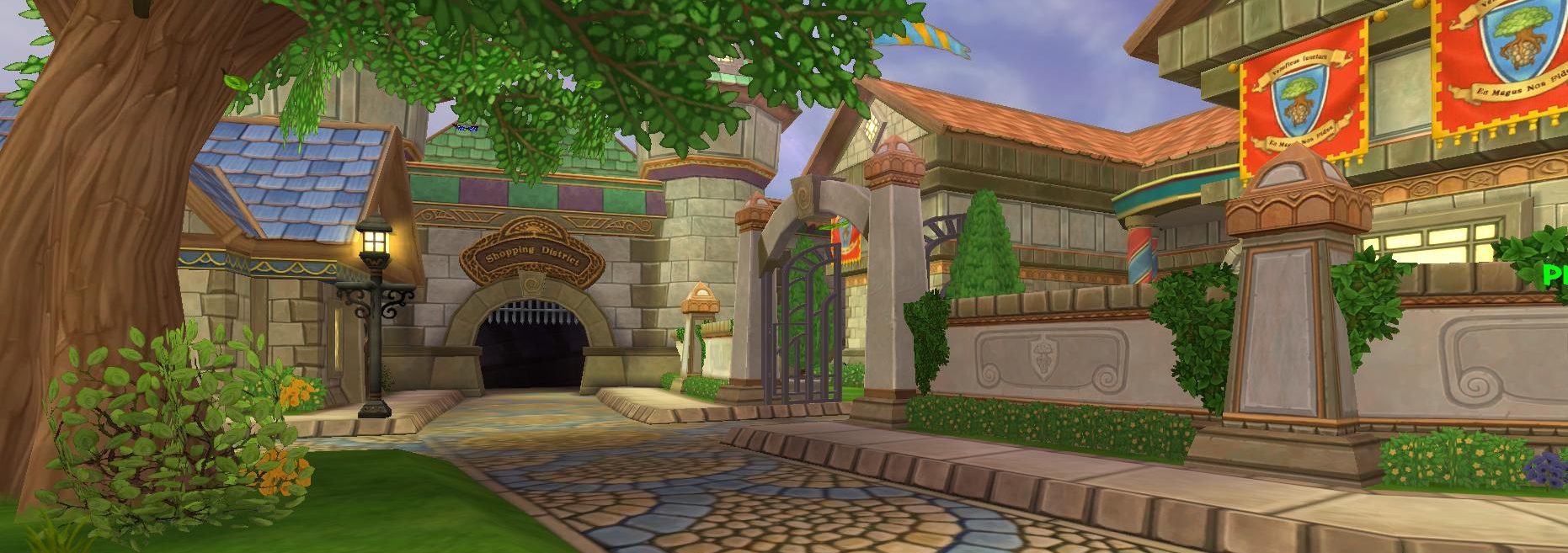
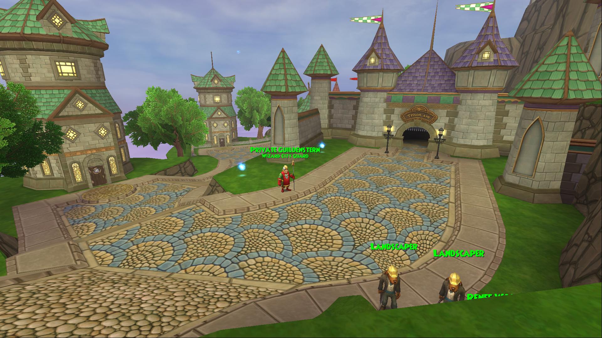
The graphic redesign is one of the biggest features in the Summer 2018 update. Of course we can’t proceed without writing an article about it and putting some thoughts in it! Wizard101 will celebrate its 10th birthday this year. It was about time that it receive a new look. This was widely requested along various platforms with most notable being videos by youtubers and posts on forums. The wish now came true and we’re finally able to see Wizard City getting a new stitch.
Appealing to the Audience
 It’s honestly a little surprising and really impressive that the game itself is doing so well after all these years. Many games on today’s saturated market can’t stand the test of time. While Wizard101 did stand the test of time, its graphics definitely didn’t. The market being saturated with games doesn’t bring too good news to developers, since a game can quickly be lost in the flood of products. But the story is completely different for us, the costumers – the players. Because there are so many alternatives and other games around, it’s actually us – the players – who have the power over developers. They need to understand our needs and, thus, make the appropriate moves.
Let’s split wizard101’s target audience into 2 main groups:
- Existing players
- New players
While existing players will most likely like the graphic redesign, that’s not the game-breaking thing for us. We were originally attracted to the game because of its cartoony graphics and its lore (pun intended). In the last weeks, or even months if we count from the time when the first “redesign quest” was released, you’ve probably heard a lot about the word “nostalgia” on social media. A big portion of the existing player-base is probably around here for this factor alone – we enjoy the game because of the good memories we have of it. As such, it doesn’t really need the fresh look. So, why was the graphics update a good decision and was it needed in the game?
Why Was the Graphic Redesign Needed?
Although the game still has a nice amount of players after almost 10 years, it’s not a big secret that this player-base is declining with every year that passes. We’ve seen the methods that KingsIsle uses to keep their revenue up – from packs and bundles to member benefits. But these are all short-term solutions. They help bring money to cover the current costs. It works for now, but for KI, it’s also a good idea to work toward long-term goals. Toward attracting new players.
We’ve mentioned that to be successful, a gaming company has to understand the market needs. Nowadays, the target audience is completely different than it was 10 years ago. Since the graphic capabilities weren’t as good as they are today, ten years ago there weren’t very high expectations. However, this has changed. The first impression of new players is really important. Without solid graphics, players might leave before even experiencing the real lore of the game. As such, the graphic redesign was necessary.
Another positive thing about the new graphic redesign is we’re bound to see new incoming players due to YouTube videos. Someone who has no idea about the game can see a video on Youtube and quickly judge the book by its cover. It’s a pretty simply philosophy. Does the game have good graphics? If yes, then it’s worth trying it out. Otherwise: no way. But in order to make this really work, more than just Wizard City should get a new look.
The Future?
 The biggest question is, what are KI’s future plans with game graphics? Will they limit themselves to Wizard City or will we see other worlds revamped as well? Limiting the redesign to just Wizard City might be enough to make new players stay around until they realize it’s actually a nice game. However, it might not be enough to keep them at the later stages. Graphics are simply too importan. Reaching old school Krokotopia after leaving fancy, new Wizard City might lead to some disappointments.
In addition, it would be fun to see some justice. I’d love for the Kroks to try to redeem themselves for the horrible things they did in past by helping making the world of sands and pyramids a nicer place. And while it’s understandable that this can’t be done in a week or two, it’s still a good idea to keep in mind and slowly work on it. Well, not too slowly…
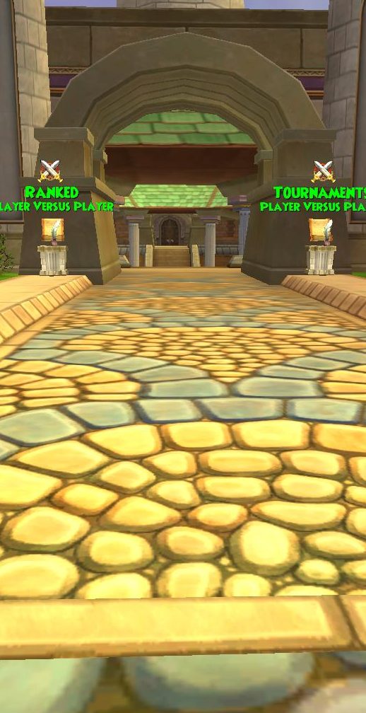
As an avid PvPer, I also want to bring up the arena redesign. The new Wizard City arena lobby looks fantastic! I really hope that the actual arenas where we’re fighting will receive a similar update as well.
Final words
Personally, I’m really enjoying the fresh look. While I’d definitely prefer some PvP updates, sometimes we need to look at things from a higher perspective. While the redesign most likely won’t have too big of an effect on PvP, we might get a few new PvP enthusiasts.
![]()
Overal, it was successful change in my opinion. KingsIsle managed to update the textures pretty well. They’ve kept the cartoony touch that we all love while simultaneously giving it a modern look. And there’s always the classic look for those that don’t like the fresh touch! It’s a win-win scenario.